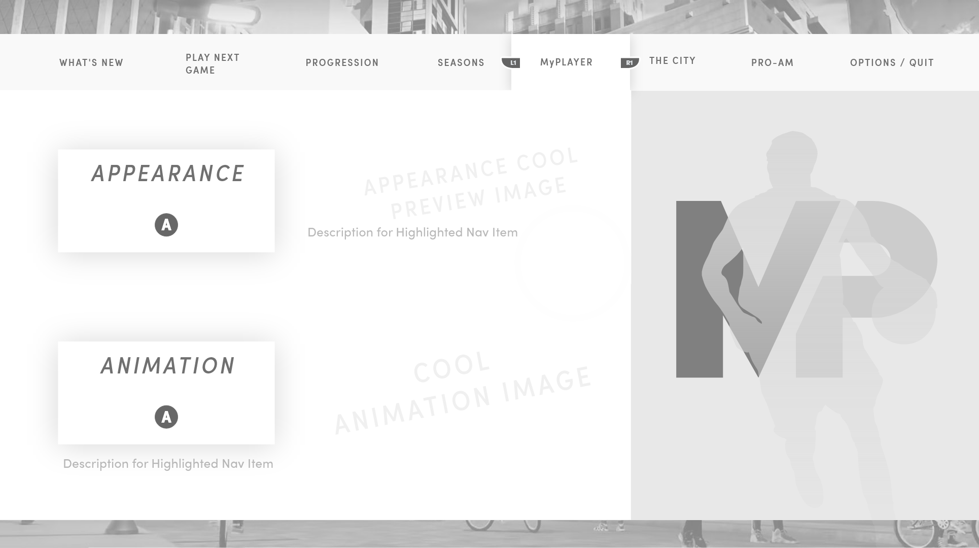
Before a player scores their first basket, they build themselves. The 2K20 character creator was the first real expression of player identity in MyCareer — and it had to feel like a stage, not a spreadsheet.
01 — MyPlayer Character Creator — Build System
The builder was redesigned to present character attributes as a visual build rather than a numerical form. Sliders gave way to a real-time 3D preview where every change — body type, face structure, position archetype — rendered immediately on the athlete model. The motion language used in the transitions was intentionally slow and reverent, giving weight to each decision. You weren't filling out a form. You were sculpting a player.
The UI stack was layered to minimize cognitive load during the heaviest decision-making: a persistent player card tracked cumulative build choices at a glance, while category panels collapsed cleanly when not in focus. The result was a creation flow that felt closer to customising a car than navigating a settings menu.
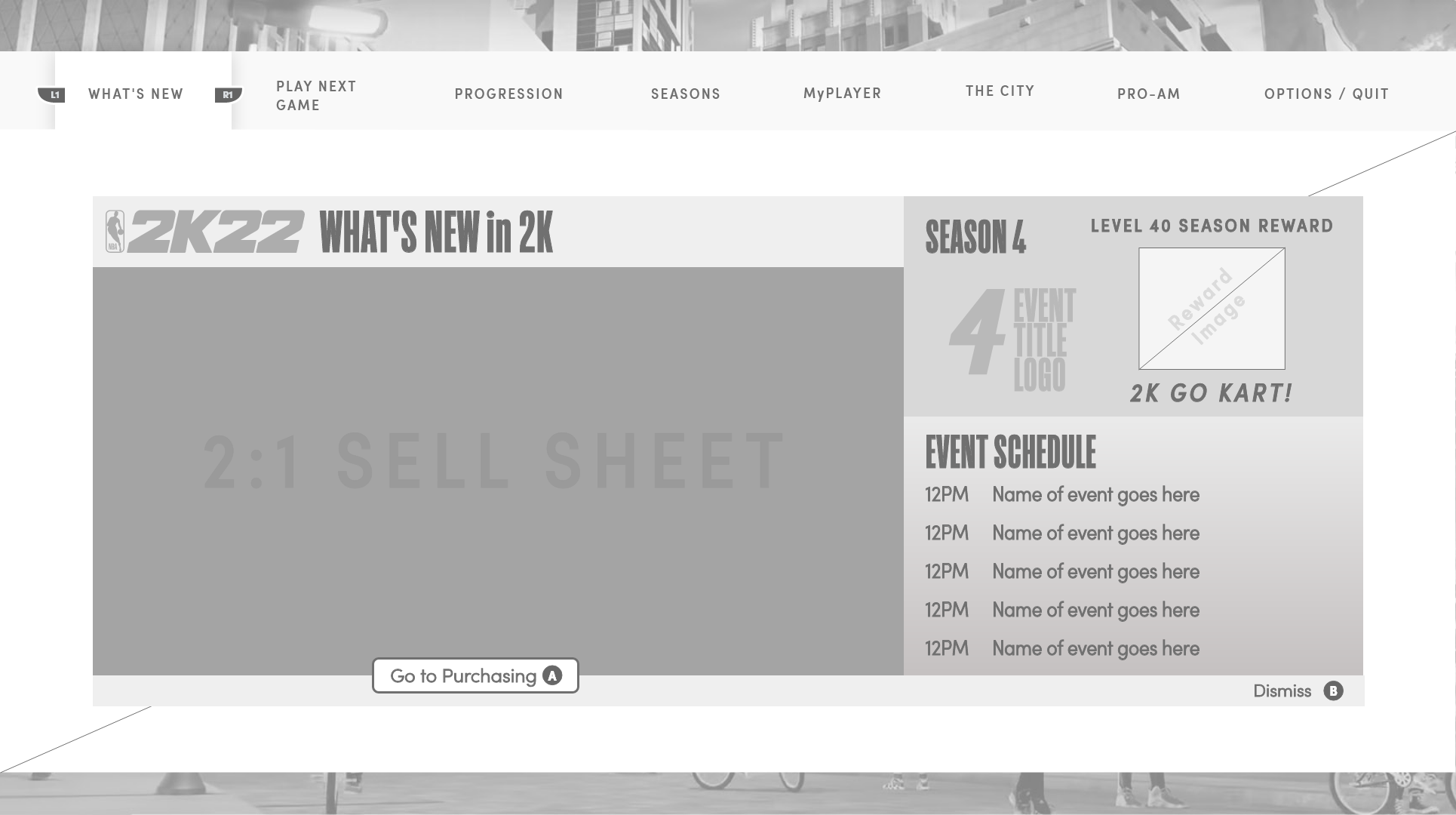
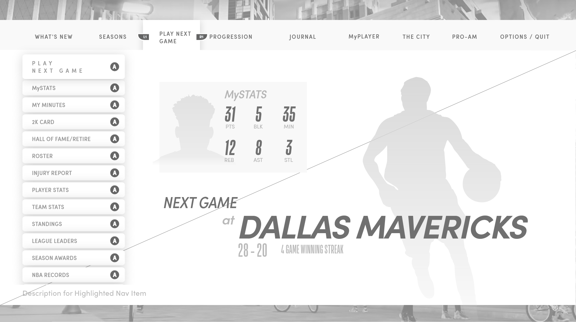
02 — 'Next' Transitional HUD — In-Game Menu
The 'Next' menu was a persistent in-game overlay — a context-sensitive shortcut layer that surfaced the most relevant action at any given moment in MyCareer. The design challenge was density: how do you give a player meaningful next steps without pulling them out of the game's world?
The answer was motion hierarchy. The primary action dominated, secondary options receded into the peripheral frame, and the entrance animation was tuned to register as a notification rather than an interruption. In practice, it reads in under a second. The visual language draws from the same cold, metropolitan palette as the 2K20 arena HUD — monochromatic with a single orange accent point driving attention.
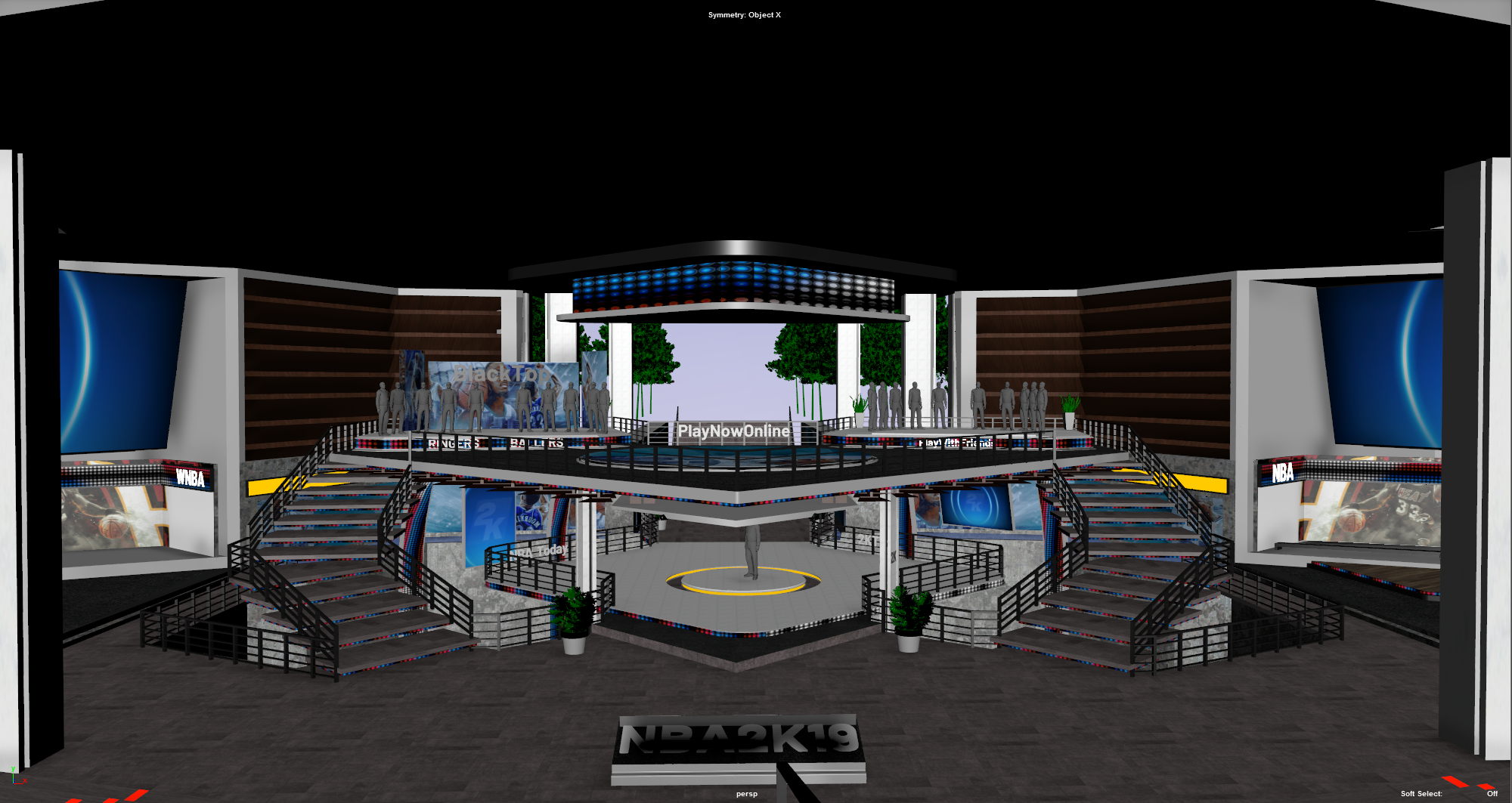
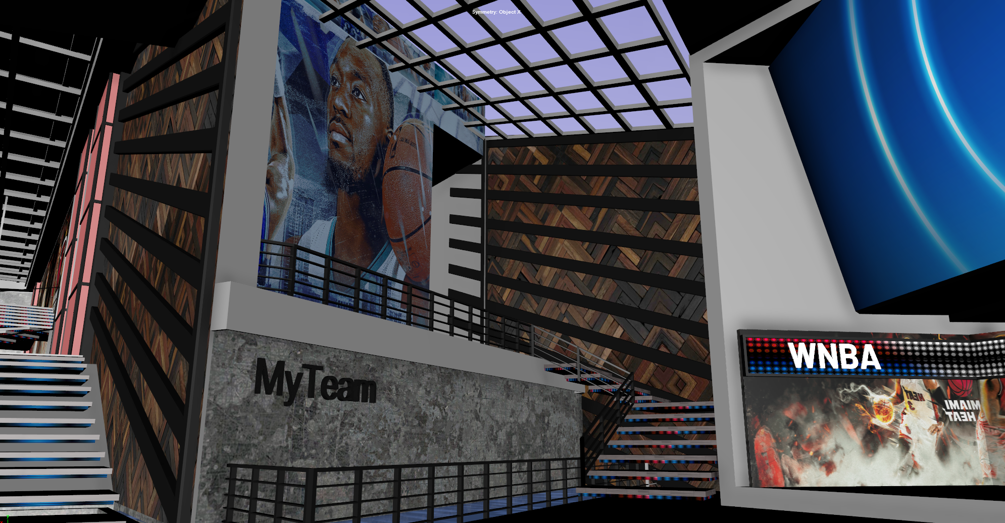
03 — Main Menu Arena
04 — MyTeam Mode UI
The arena UI system for 2K20 used a dual-navigation approach that was new to the franchise — a persistent top-level nav and a contextual sub-nav that changed based on the selected mode. The structure reduced the number of taps to reach any feature, and the visual treatment (dark glass panels, tight typography, minimal iconography) kept the focus on the content rather than the chrome. The arena visual design was led by Albert Carmona, with whom I worked closely on the UX flow that tied the navigation, mode framing, and contextual overlays together.
05 — In-Game Hub — Lo-Fi UX
A pause menu that became a system.
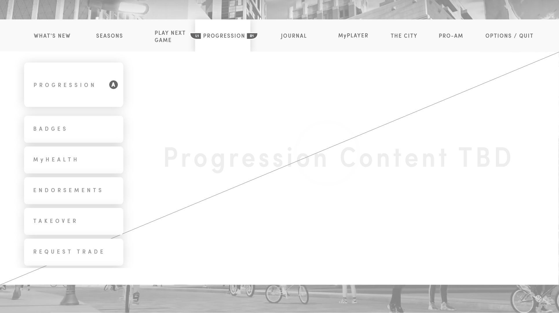
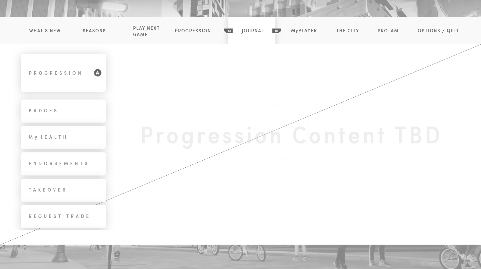
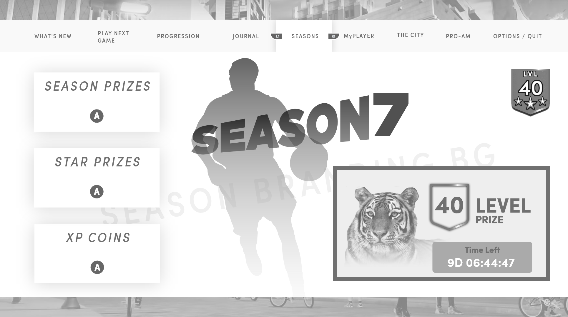
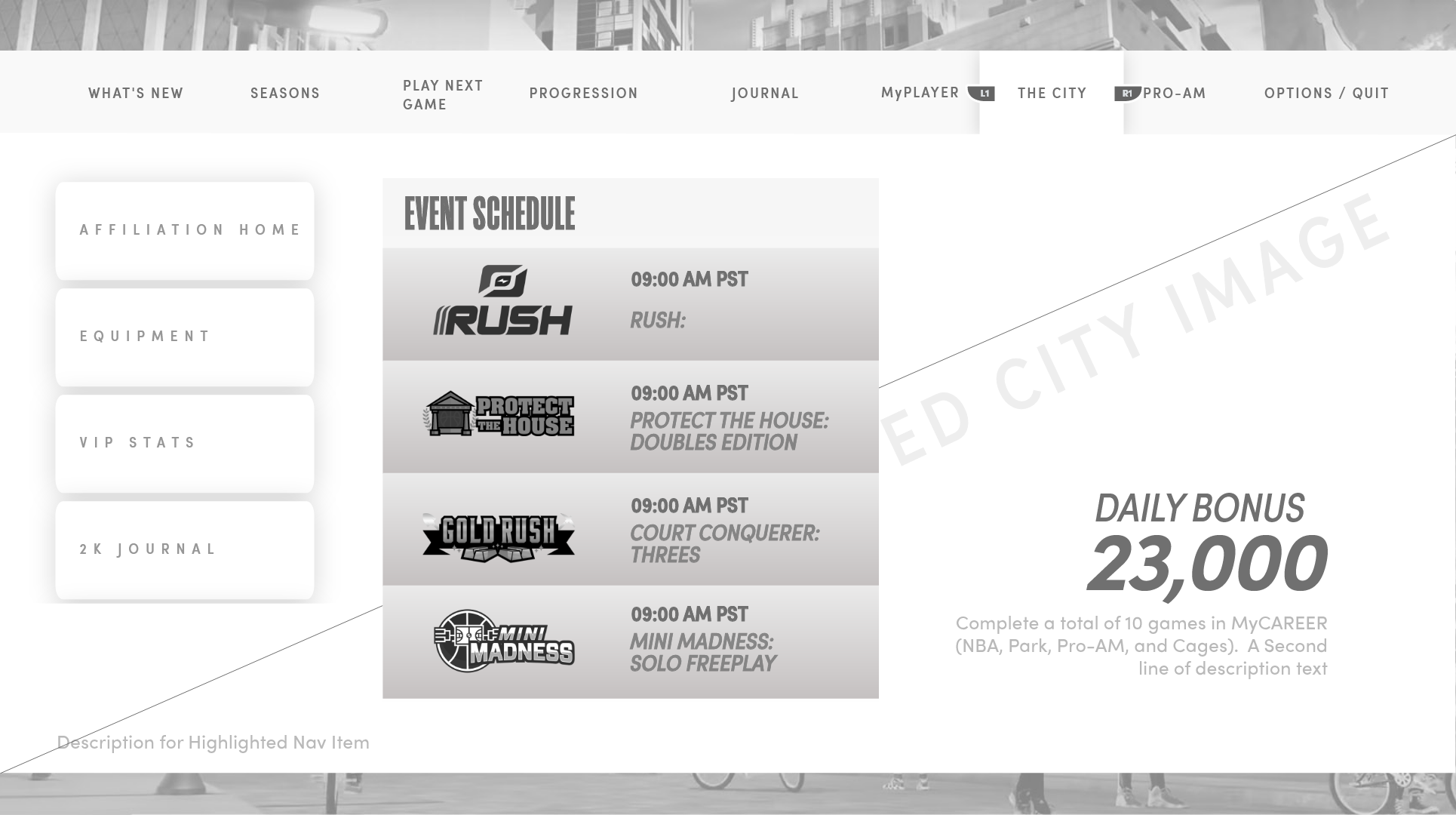
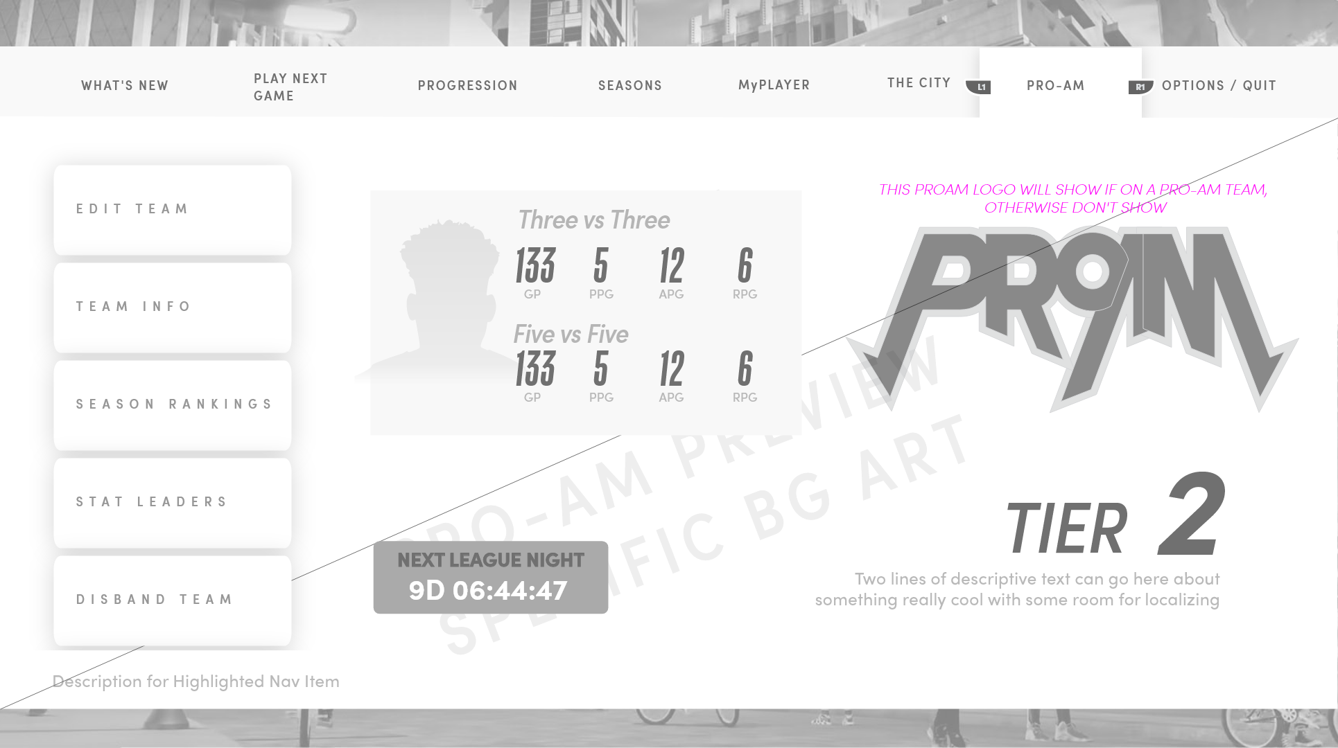
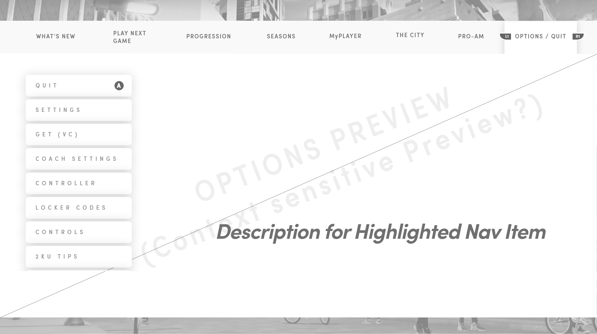
I designed the lo-fi UX for an in-game "pause menu" of sorts — a quick-access surface for managing the player's in-world character, activities, and current events without leaving the moment. Each nav node had a defined content slot, contextual sidebar, and rules for what gets promoted into the right-hand preview. The foundation laid down here became the system that all future menus across NBA 2K's offerings would inherit and extend.
06 — Evergreen Mode Logos
Marks built to outlive the release.
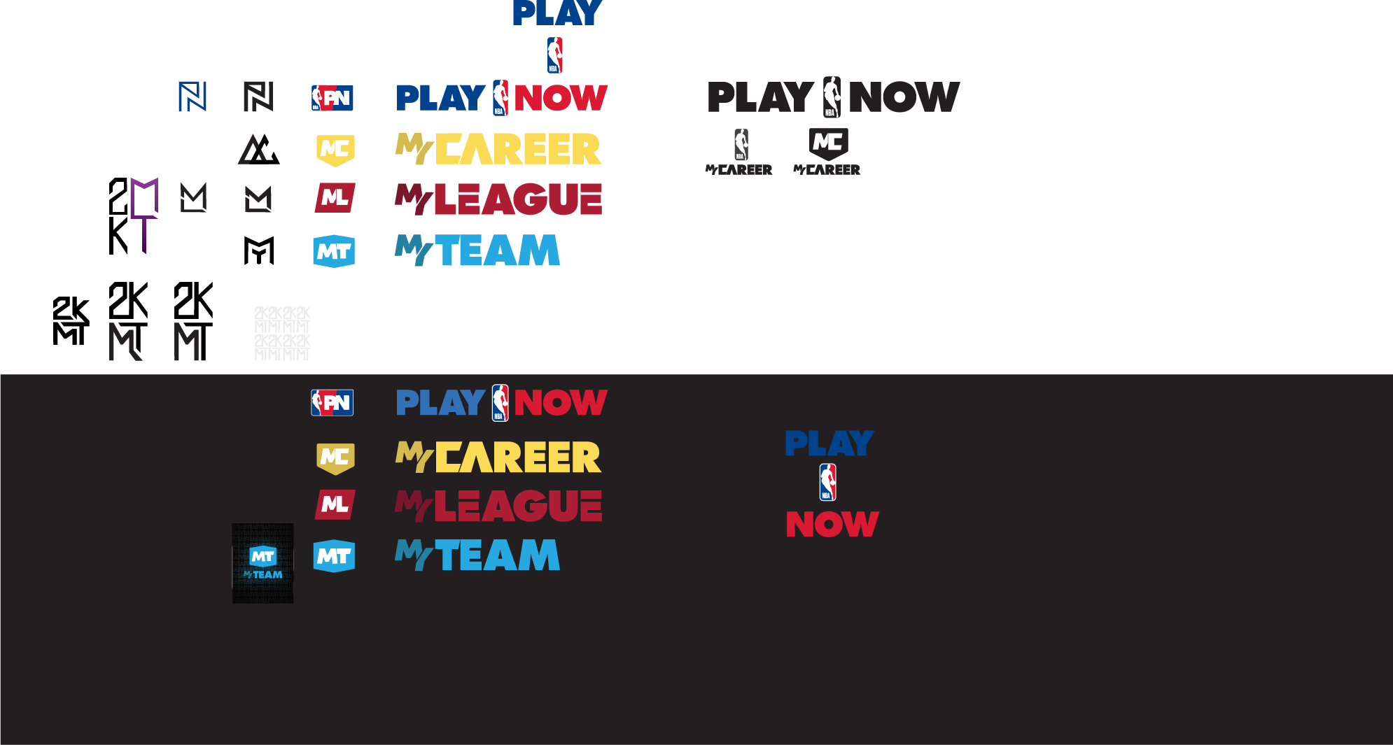
On the same project I art-directed the evergreen Game Mode logos — marks designed to stand up across multiple franchise releases and marketing surfaces rather than being thrown away each season. They have since carried forward into many future titles. Later animation and motion treatment for the mode logos was a close collaboration with Ernex.
07 — Mode Logo Transitions
Evergreen marks in motion.
I directed and worked closely with Ernex to produce these transitions from the logos I designed, extending the static marks into a motion language that could carry across game modes and future franchise releases.
Play Now
MyNBA
MyTEAM
The W
The City
WNBA