2K15 was the year we stopped treating the menu like a screen and started treating it like a place. From the visual styleguide that anchored every surface to the physical camera system that let the UI breathe in 3D space, this was end-to-end ownership of a next-gen first impression.
01 — UI Concept Visual Design
The styleguide that set the tone.
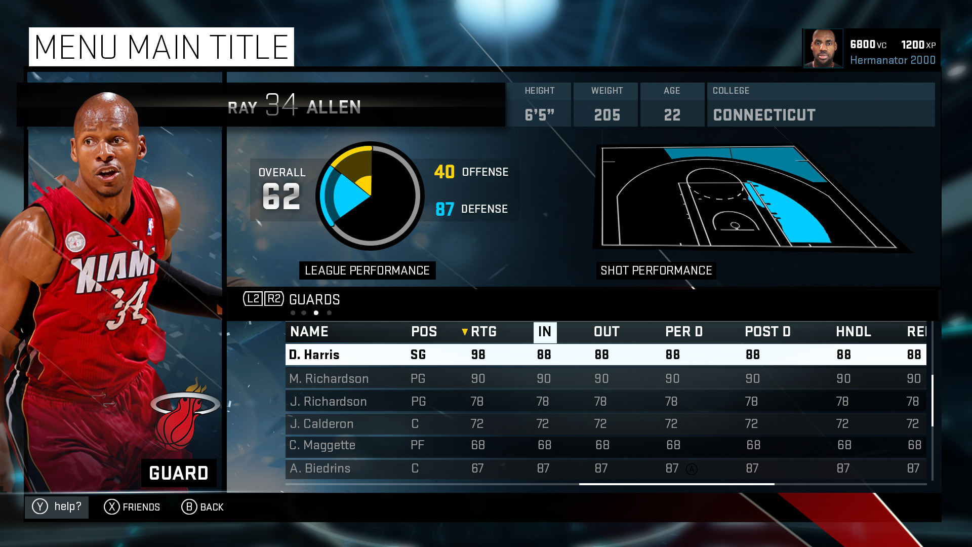
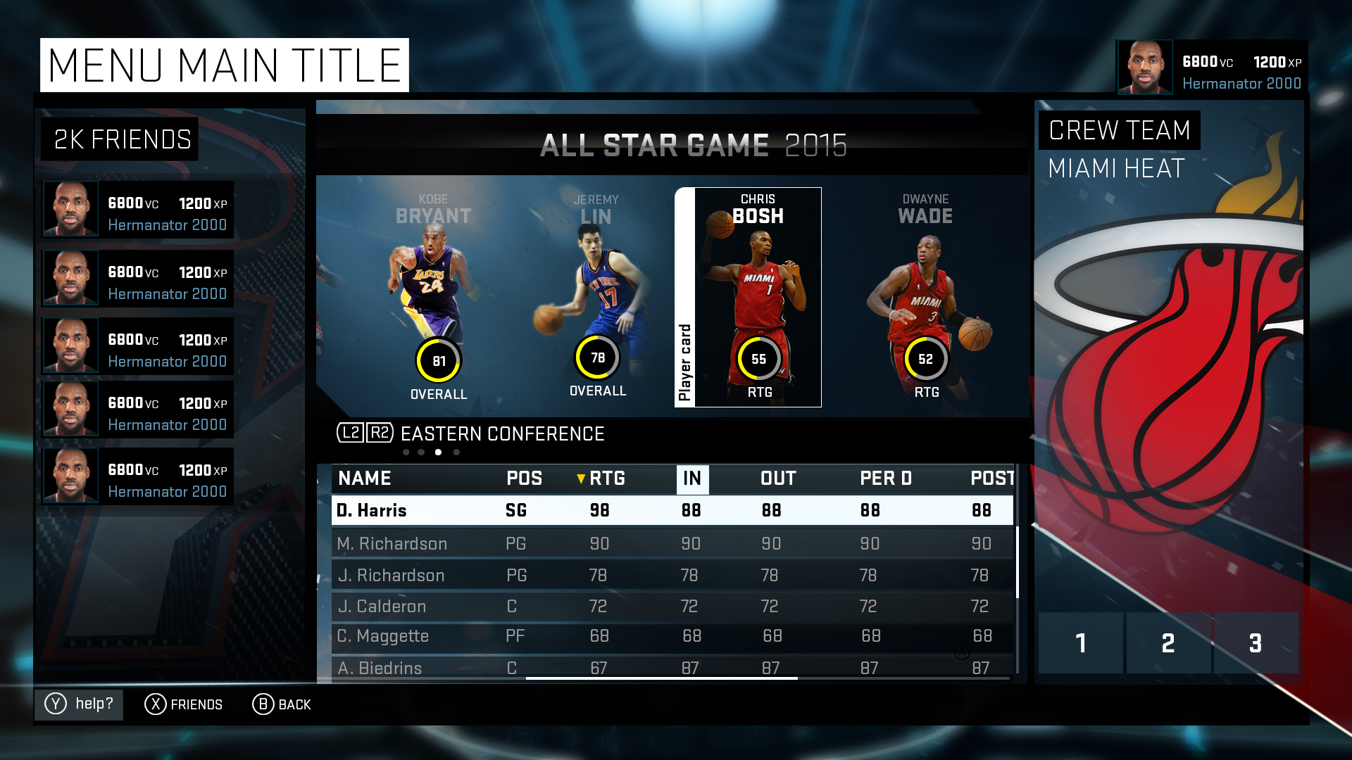
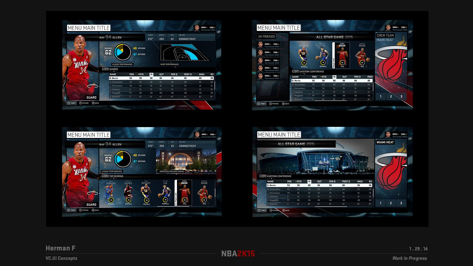
UI concept visual design done by me, used as the styleguide for the rest of the UI on 2K15. Every downstream surface — mode branding, in-game overlays, presentation layer — was traced back to the language set in these frames.
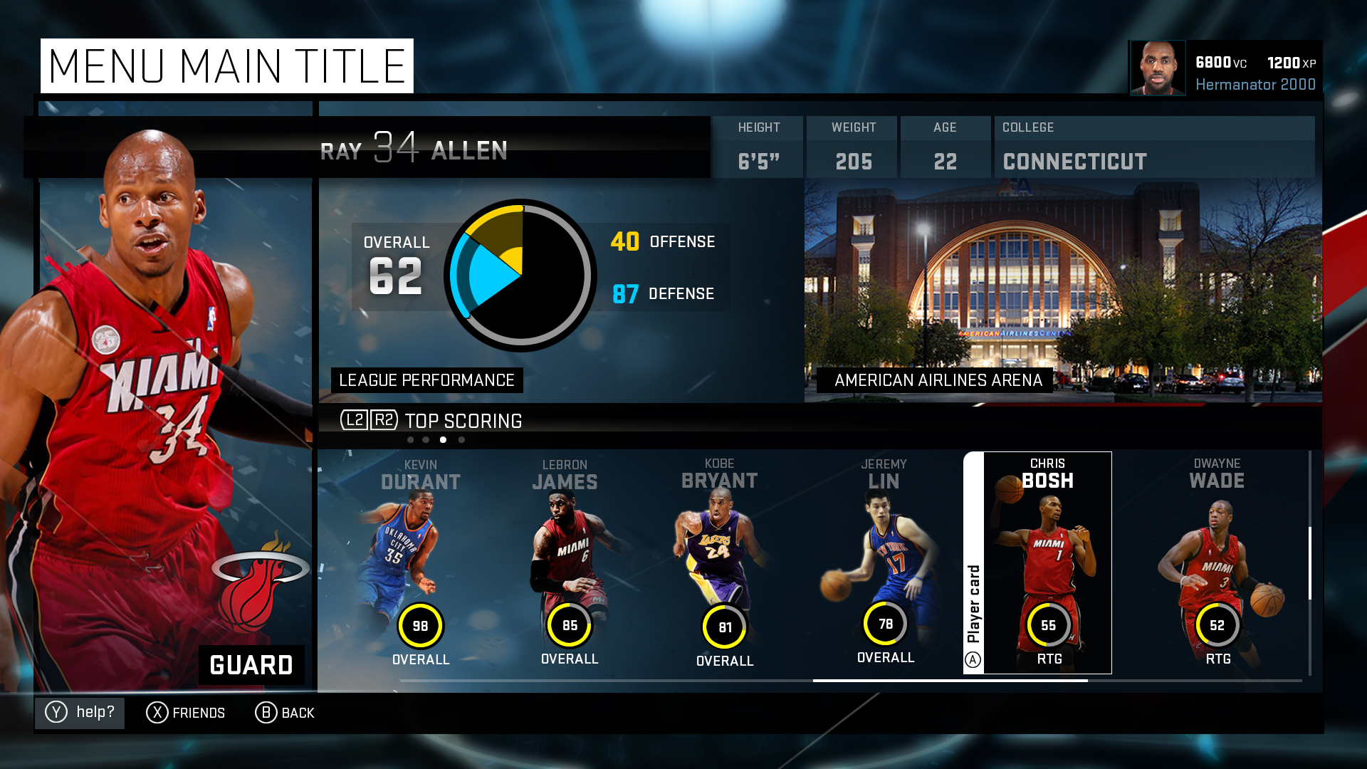
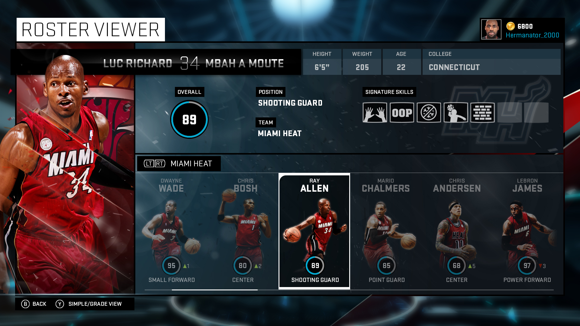
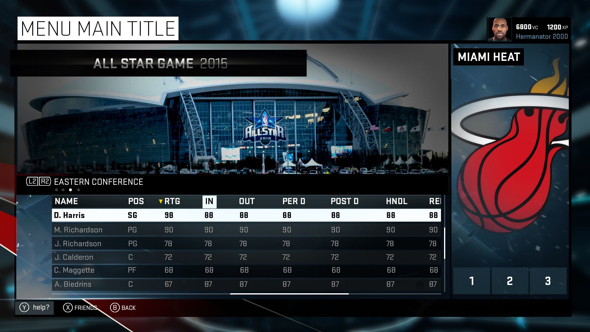
02 — Spatial Main Menu
Environment, camera, anchored UI.
I designed the spatial Main Menu UI/UX end-to-end — the environment, the camera animation flows, and the anchor points that bound menu elements to the world. The polished pass plays in the hero above; the early in-engine clean visible here.
03 — The Physical Camera System
A first for NBA 2K's UI.
I planned, built, and reworked — with our talented engineers Kefei Lei and Johnnie Yang — the first physical camera system and in-world menu marker usage in NBA 2K's UI. It went on to be used and pushed forward across many of the franchise's highest-profile first-impression systems in the years that followed.
04 — Presentation Direction
High-energy sports wipes, same language.
I was also directing the game's Presentation layer — high-energy sports wipes, transitions, and overlay sequencing. Because the visual design language and environment had already been established in the styleguide, it was easy to propagate that DNA forward into every in-game wipe and broadcast moment.
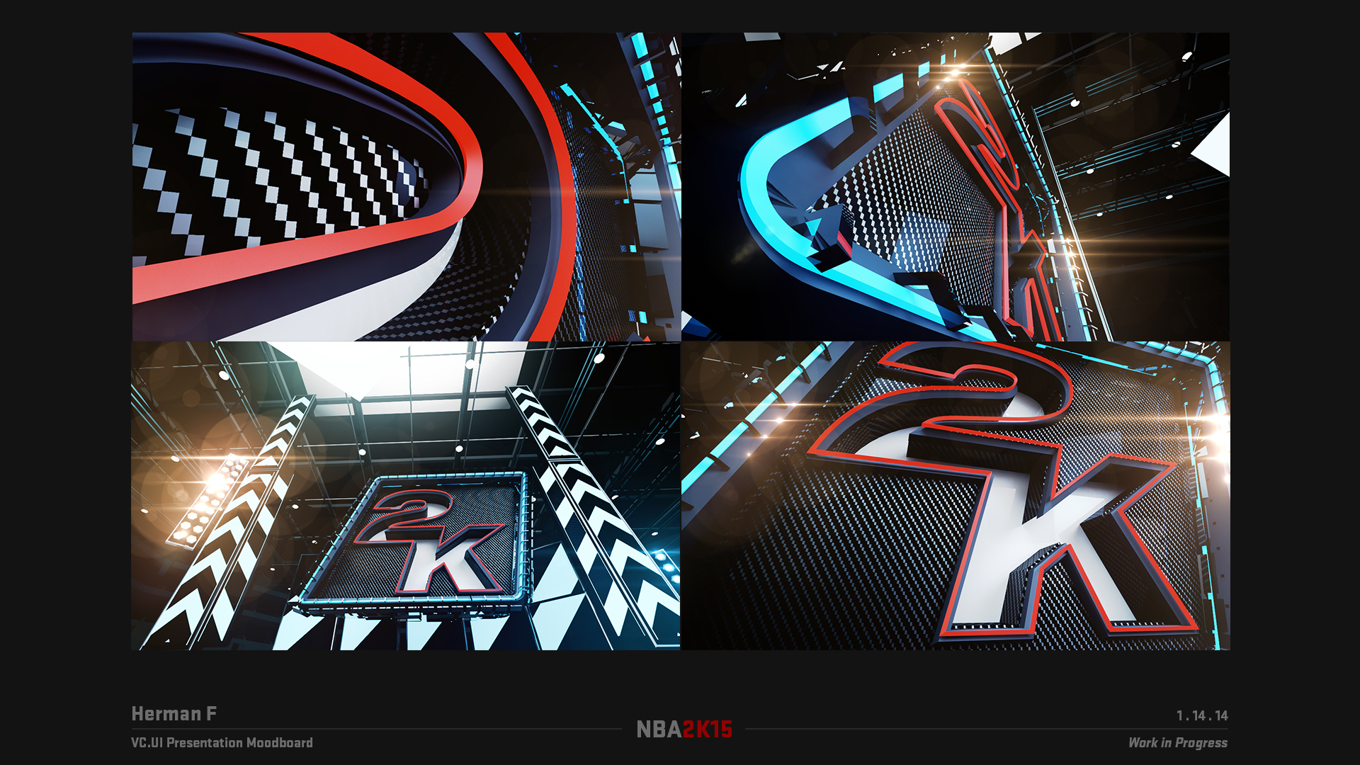
05 — BreakBoard
Overlay UI in motion.
The presentation direction inspired the Presentation UI overlays. Here's a sports "BreakBoard" — the broadcast-style stat card that flashes between possessions, built on the same hard-edged motion grammar as the wipes.
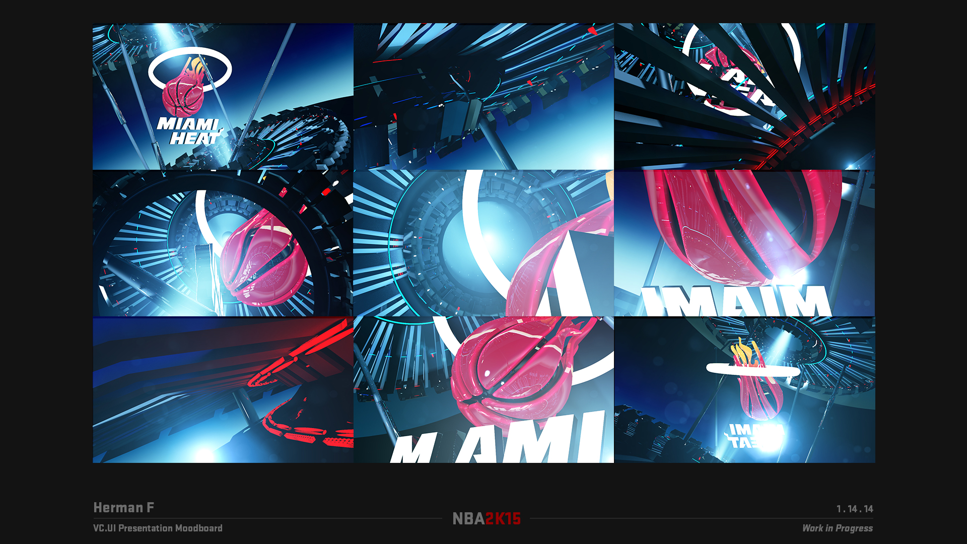
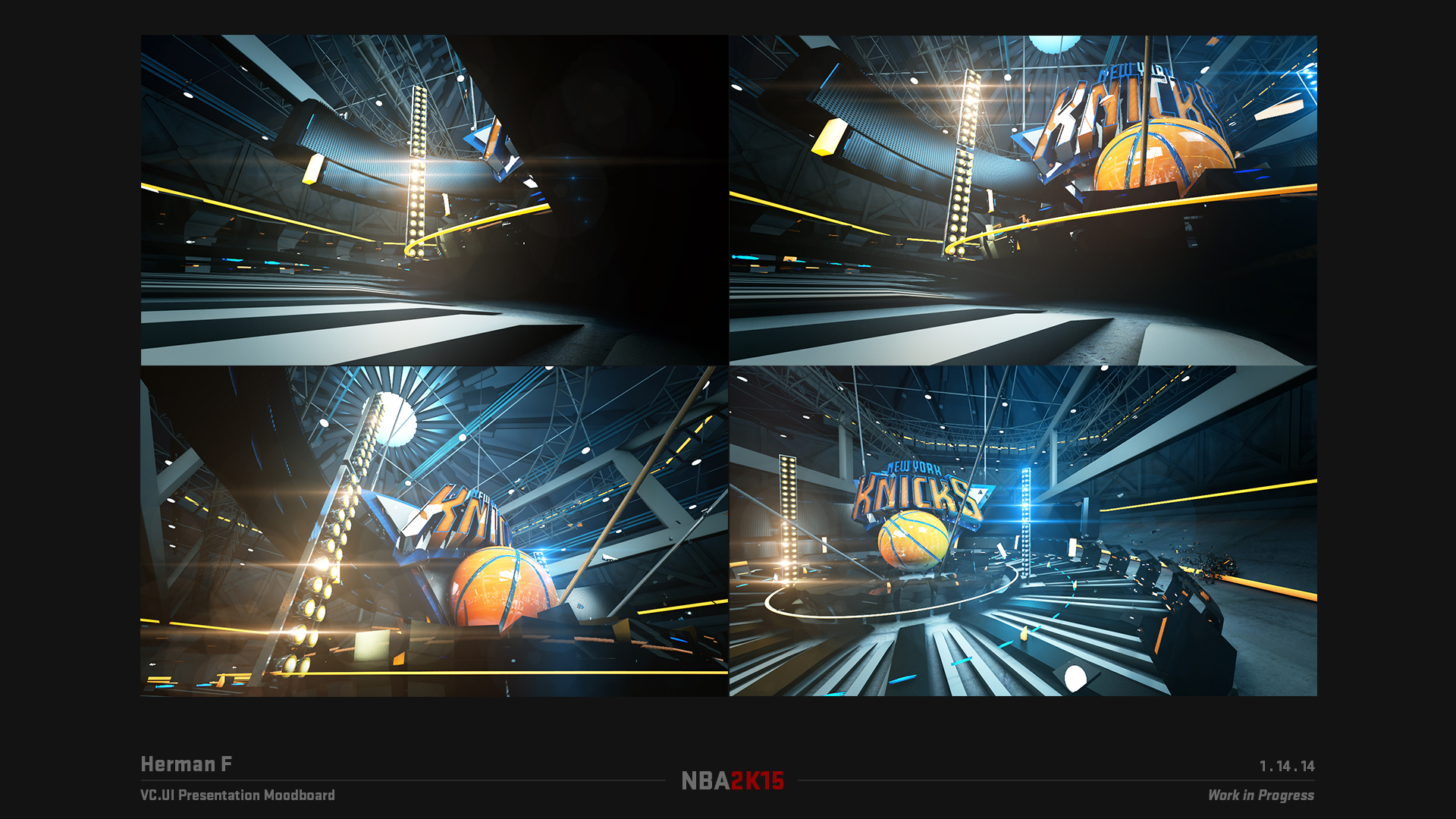
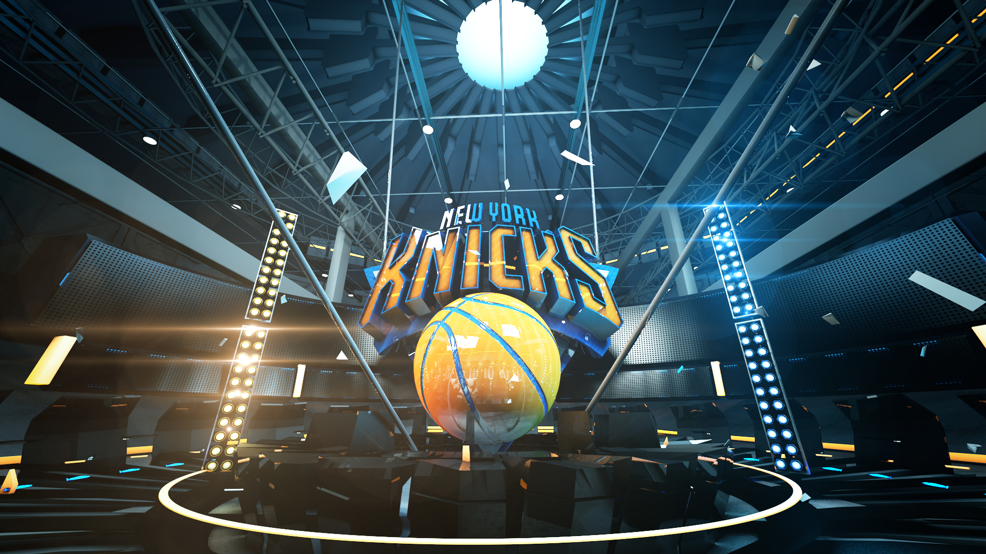
06 — Cinematic Team Logo Wipes
Outsourced where the engine couldn't go.
For moments that needed more than in-engine could deliver, we used the same visual language to brief and outsource cinematic-quality 3D team logo wipes. These were produced by Geoff Hecht and his formerly-owned Hectic Studio — pre-rendered, broadcast-grade, and tuned to drop straight into the same motion cadence as everything else on screen.
2K15 was a passion project — hands-on ownership of concept, direction, and technical direction, all while pushing the boundaries of UI technology in-engine as a 1st‑year UI/UX art director.